Joshua Schmitz
Design Leader
Product Engineer
Avid Musician
Only Human
AeroSpacecase
Shaping the Future of Technology Through Design
Bridging creativity & innovation to deliver visionary solutions for aerospace, automotive, & cutting-edge products.
Contact Now-
Shaping the Future of Technology Through Design
Bridging creativity & innovation to deliver visionary solutions for aerospace, automotive, & cutting-edge products.
-
What does the future hold?
Perhaps the Spacecase
will go to Space
Joshua Schmitz
Design Leader
Product Engineer
Avid Musician
Only Human
AeroSpacecase
-
Shaping the Future of Technology Through Design
Bridging creativity & innovation to deliver visionary solutions for aerospace, automotive, & cutting-edge products.
-
What does the future hold?
Perhaps the Spacecase
will go to Space
I Am Joshua Schmitz
The AeroSpacecase
I craft meaningful experiences with products AI brands people you
Recent career highlights include:
- AI-driven tools to streamline Moody's workflows
- Leading design system implementation for products: Visa, Freedom Mobile and Blue Shield CA
- Founding a design consultancy that has guided startups and Fortune 500 companies to design success
Every project I take on reflects my commitment to solving complex, high-level problems with a focus on clarity, usability, scalability, and tangible results. Lately, I languish in IC-level roles. I thrive in exploring the unknown and innovating, conceptually pushing boundaries into novel discoveries.
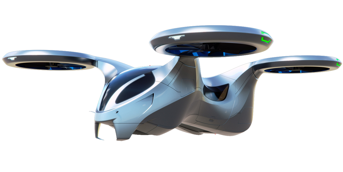
As someone closely aligned with the INTJ profile, I thrive on tackling the challenges of tomorrow, my current ideal position would focus on cutting-edge VTOL aircraft, designing EVs, or a closely related Renewable Energy project.
Notable Organizations I’ve Served












Product Strategy
& Research
- Usability Testing
- Competitive Analysis
- User Interviews
- Mapping & Taxonomy
Branding
& Consistency
- Visual Language Development
- Logo & Identity
- Brand/Style Guides
- Design Systems
Product
Design
- User Interface & Experience
- Flows & Wireframes
- Interface/Interaction Design
- Journey Mapping
Aerospace Engineering
(NEW!)
- Design, Prototyping, & Surfacing
- Materials & Stress Testing
- Controls & Systems
- Catia, Solidworks, & Blender
App & Game
Development
- HTML, S/CSS, & JS
- Unity & Unreal Engine
- Sprite & Level Design
- Combat Design & Choreography
Fine Art & Music
(Always)
- Guitar, Vocals, & Voice Acting
- Screenprinting & Printmaking
- Metalwork & Sculpture
- Architectural & Environmental Design
